-
dima
-
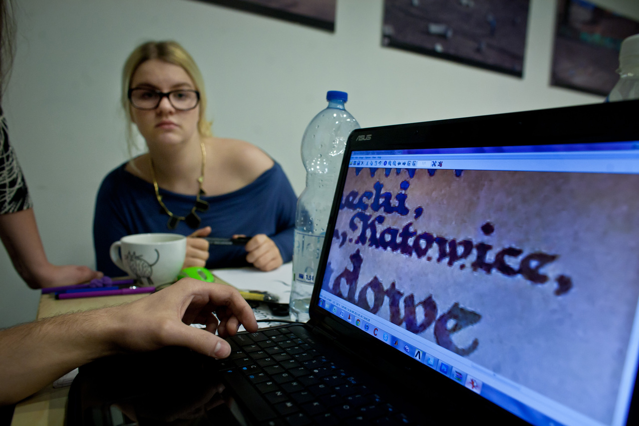
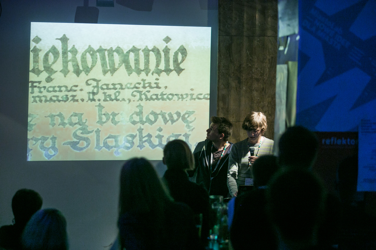
» Pischinger Typeface
Today’s appearance of Katowice streets stems from the city’s complicated history of mutually conflicting styles and conventions, ranging from the gaudy glamour of modern advertising language, through hand-made shop signs and neon lights, to even earlier Art Nouveau influences. More inspiration, however, is found in the region’s documents, which reveal a clear German influence – propaganda posters related to the Upper Silesian plebiscite represent the sharp opposition between the two countries, also in terms of the graphic language used. The calligraphic tradition, on the other hand, abounds in surprising connections, drawing from many styles and conventions. Pischinger multilayer typeface, in which each successive layer expresses the nature of another period in Katowice’s history, well reflects these correlations. In some cases the font’s design features used enhance the clarity of the message, while in others they weaken it, illustrating the present state of the city’s typography. Find out more.
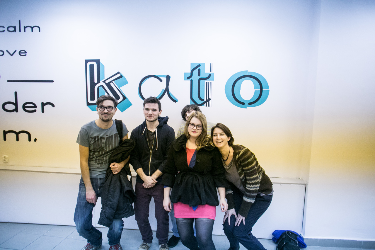
Medialab Katowice
a brief roundup of 2013