-
» Sound Map of Katowice Greens
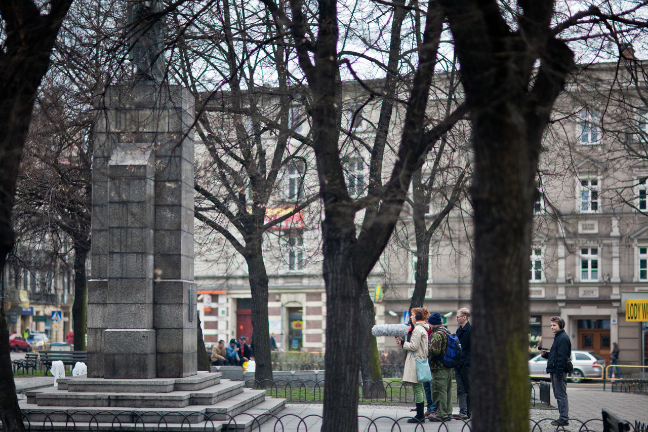
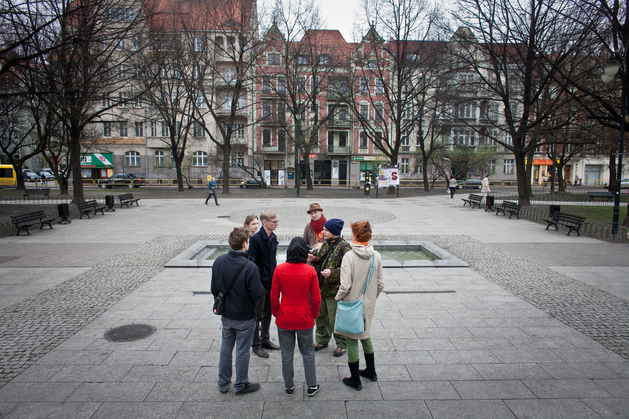
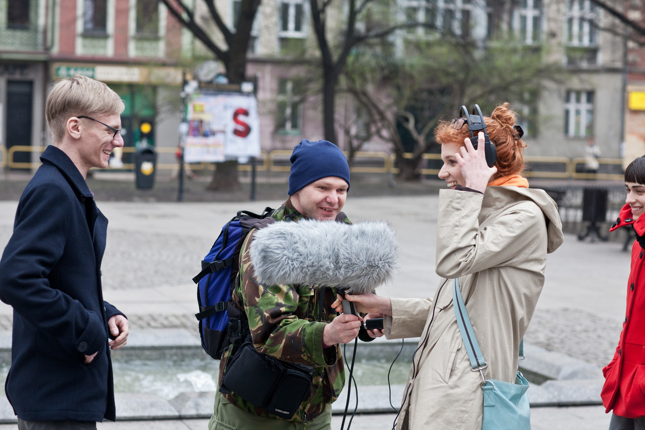
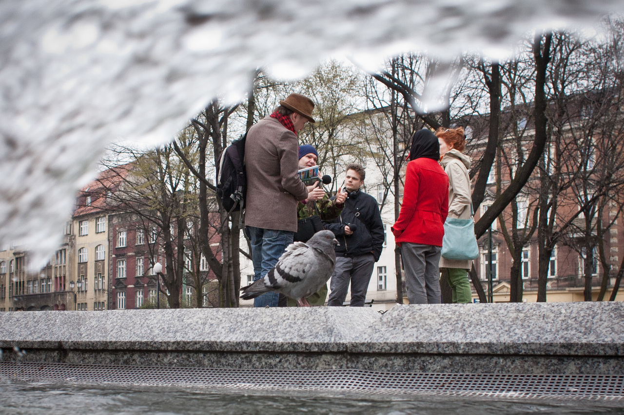
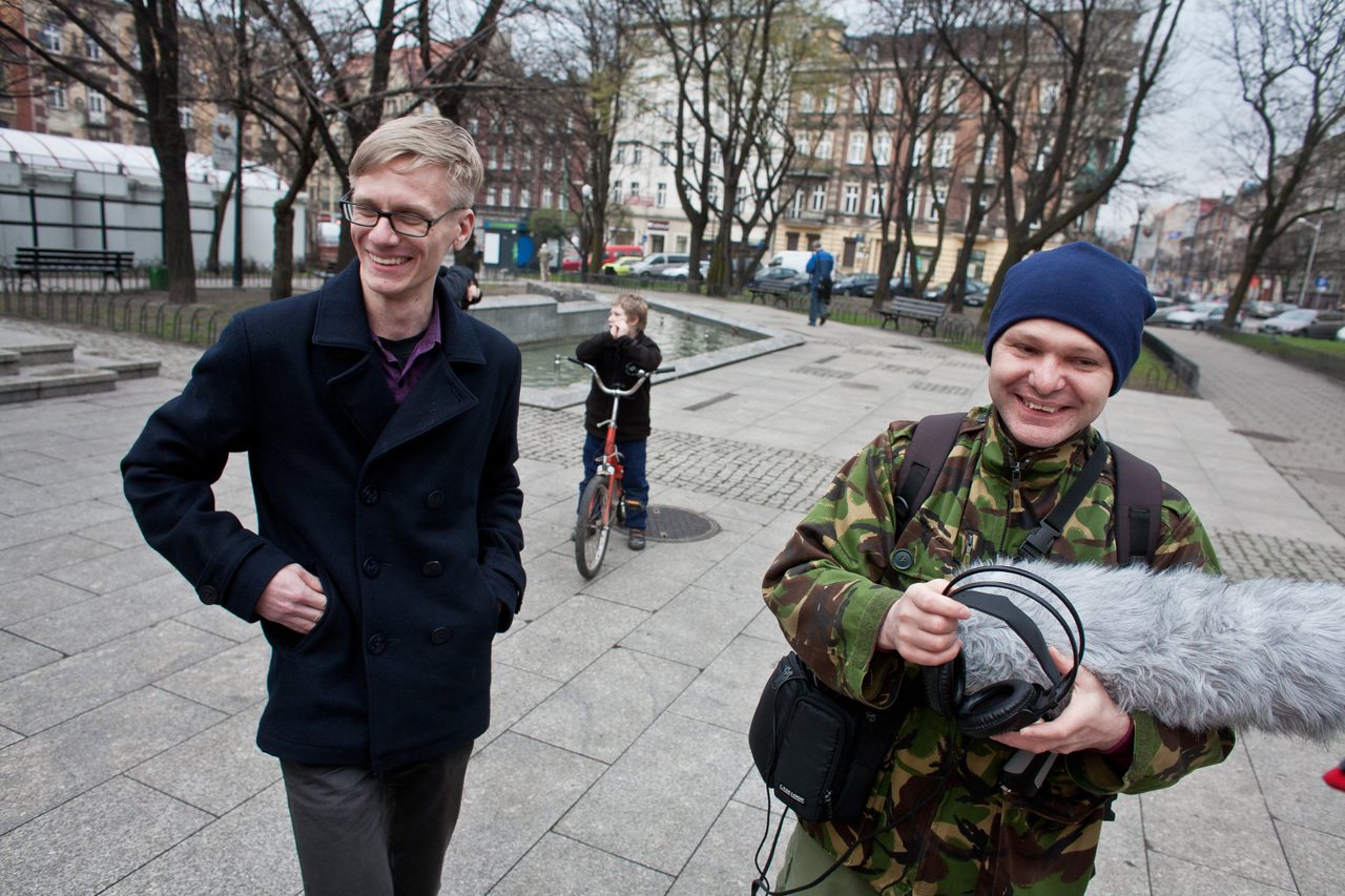
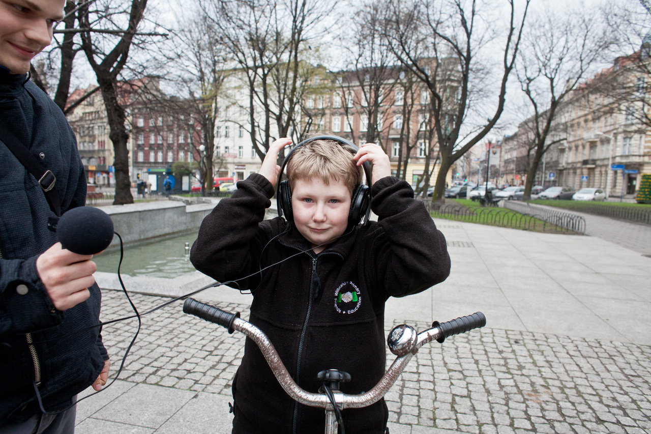
The map refers to the idea of the City of Gardens. We were interested in the city’s greens, which cover about 40% of its total area, and above all in the sound environment of public spaces in the city centre. We usually complain about the noise caused by the surrounding roads and other unpleasant sounds of the city, but few of us realise that the sound environment can be designed, just as we design buildings and urban systems. In some cases, the study led to surprising results, standing in sharp contrast to the commonly accepted image of the space. This was the case in Kosciuszko Park, surrounded on three sides by some of the busiest streets in the city. The recordings were also an extremely interesting and unconventional way to explore Katowice, leading us from the squares in the centre, through the industrial areas, to the beautiful forests and nature reserves. We do encourage you to embark on this unique sound tour. Listen to the city. -
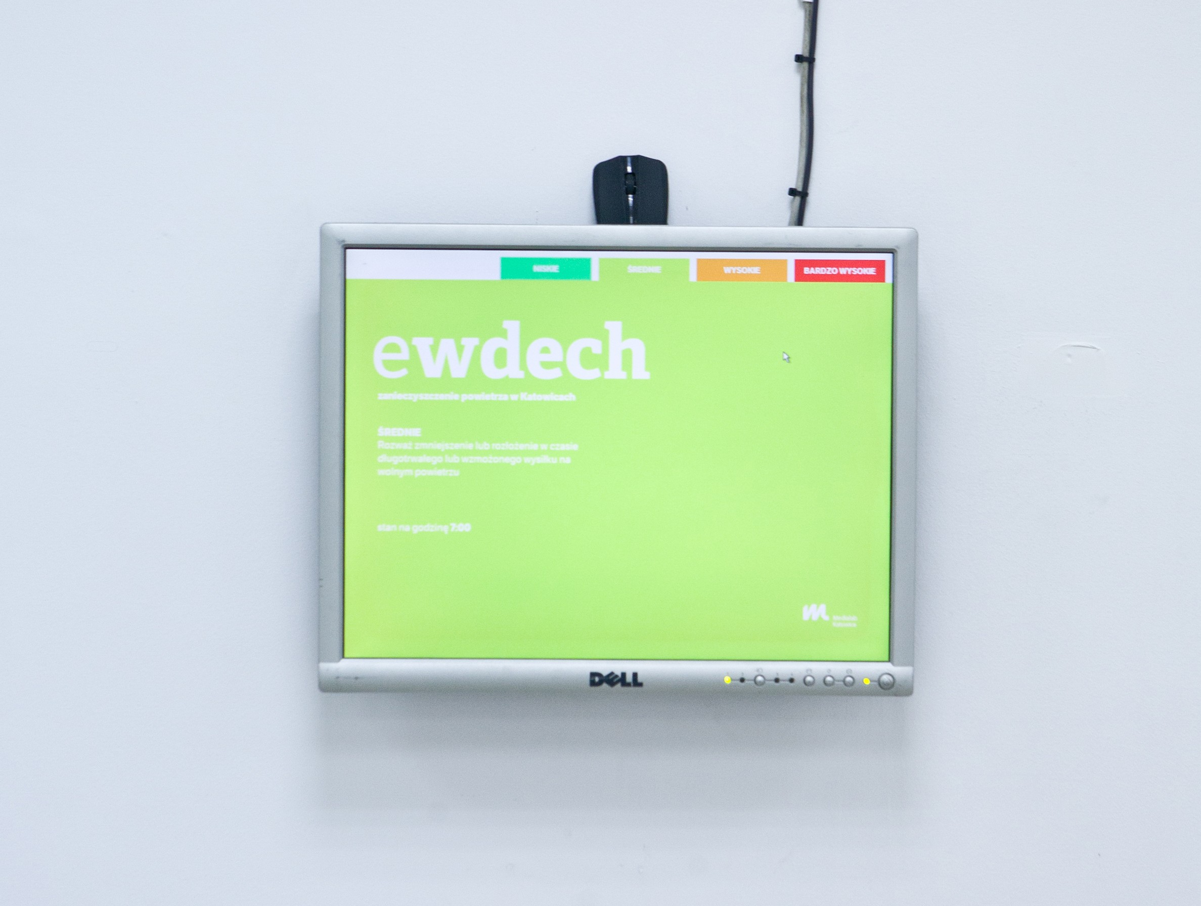
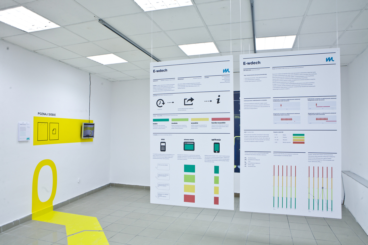
» E-breathe. Katowice Air Quality Information System
The aim of the project is to provide Katowice’s residents with easy access to information on air pollution. Even though this information is already available on the Internet, we believe that there is room for improvement with regards to the way it is presented to the average resident. Our plan is to share the data via a SMS-based system, a dedicated website and an application for mobile devices. The resident group on which we have focused our attention is parents of children troubled by respiratory diseases, including asthma, because they are more sensitive to airborne contaminants. Check out our prototype. -
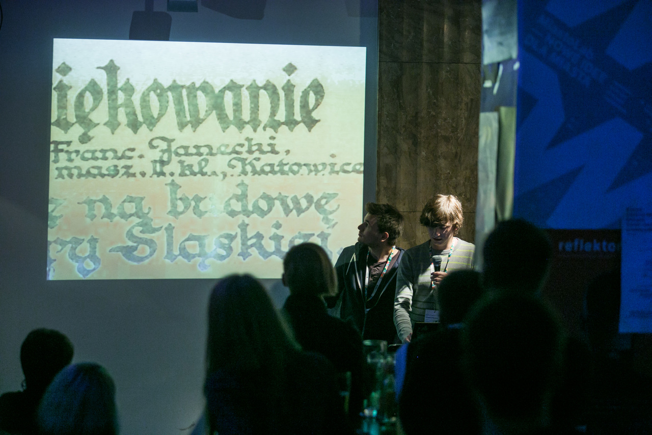
» Pischinger Typeface
Today’s appearance of Katowice streets stems from the city’s complicated history of mutually conflicting styles and conventions, ranging from the gaudy glamour of modern advertising language, through hand-made shop signs and neon lights, to even earlier Art Nouveau influences. More inspiration, however, is found in the region’s documents, which reveal a clear German influence – propaganda posters related to the Upper Silesian plebiscite represent the sharp opposition between the two countries, also in terms of the graphic language used. The calligraphic tradition, on the other hand, abounds in surprising connections, drawing from many styles and conventions. Pischinger multilayer typeface, in which each successive layer expresses the nature of another period in Katowice’s history, well reflects these correlations. In some cases the font’s design features used enhance the clarity of the message, while in others they weaken it, illustrating the present state of the city’s typography. Find out more. -
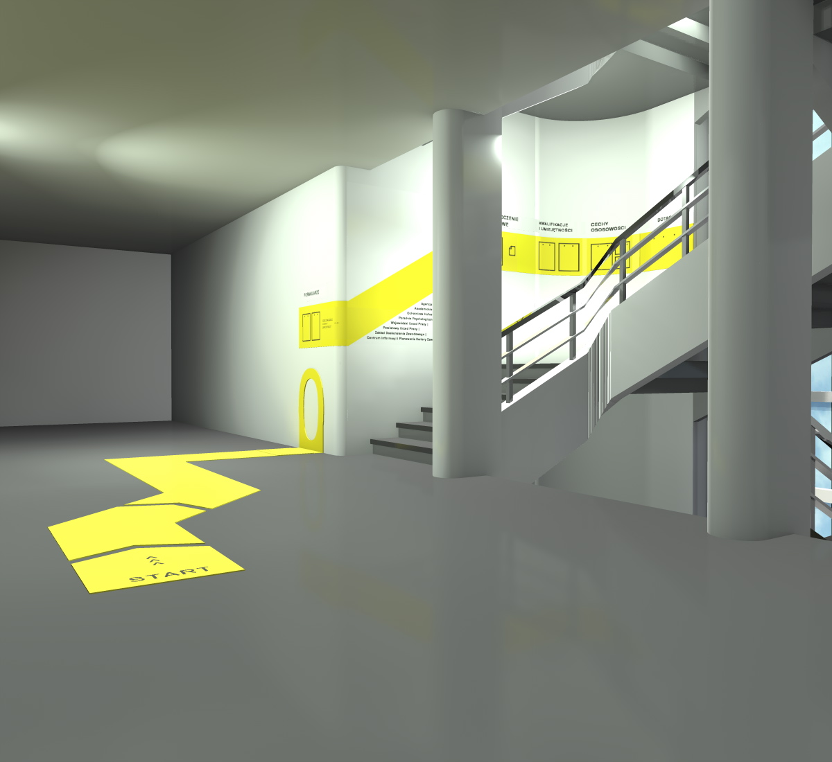
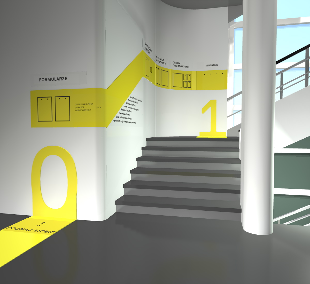
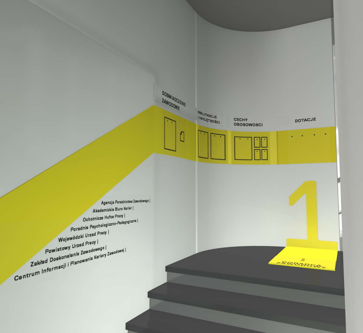
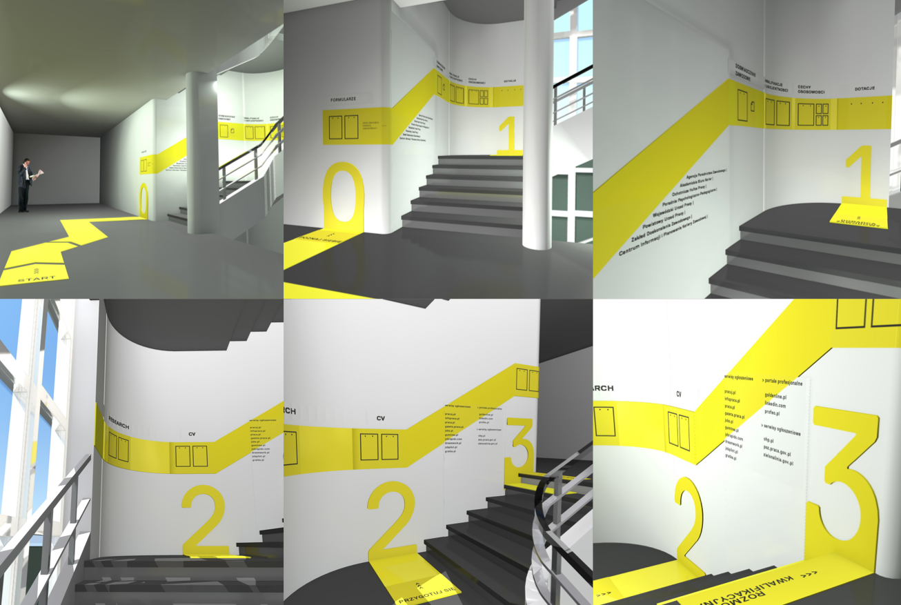
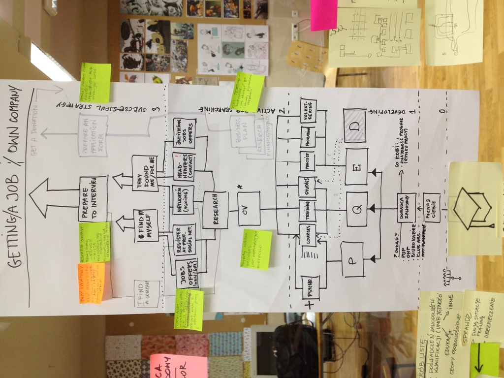
» A Graduate on the Labour Market
A major challenge to combating unemployment is the situation of university graduates entering a new phase of life. With no clear vision of what they want to achieve, they make rather random choices whit a potentially critical effect on their later careers. There are a lot of materials to help the unemployed find that much-needed job. Unfortunately, such information is scattered, so getting accurate advice becomes a considerable challenge. A thorough review of available information allowed us to extract information suitable for graduates. Our goal was to create a map with which one can intuitively obtain relevant information. We based it on the four levels of knowledge, which correspond to the information folders and forms to promote self-motivated action. It was important for us to present information in map form, so we used the stairwell of the Faculty of Philology at the University of Silesia. This made it possible to show climbing up the knowledge ladder in a symbolic way and at the same time extend the offer to individuals seeking specific support. By Marcin Gołdyn, Paulina Urbańska, Sylwia Widzisz-Pronobis. -
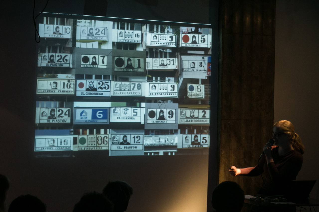
» A Visual Information System for the Millennium Housing Estate
The project has been developed in response to the complex and confusing street naming and house numbering system in use at Katowice’s Millennium Housing Estate. The current chaos is caused by certain management issues affecting what is one of the largest and most populous residential areas in Katowice. Run by three different housing cooperatives, the estate has 10 street names which have survived from the early days of its existence and 4 streets named in recent times. While the original names consistently draw on historical references, the contemporary ones have been chosen in a somewhat random fashion. The problem is both a lack of consistency between the old and new street names on blocks of those featured on maps as well as an inconsistent colour-coding system of the streets. With this in mind, the project aims to develop a new information system. The original designation of buildings has been simplified and now feature just block numbers and street names enhanced by comic-book inspired pictograms redesigned in adherence to their original form. By Katarzyna Wolny | Find out more. -
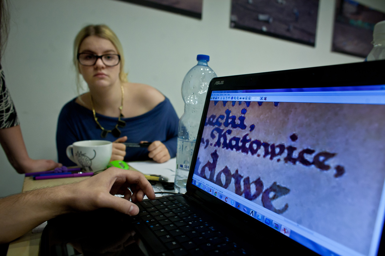
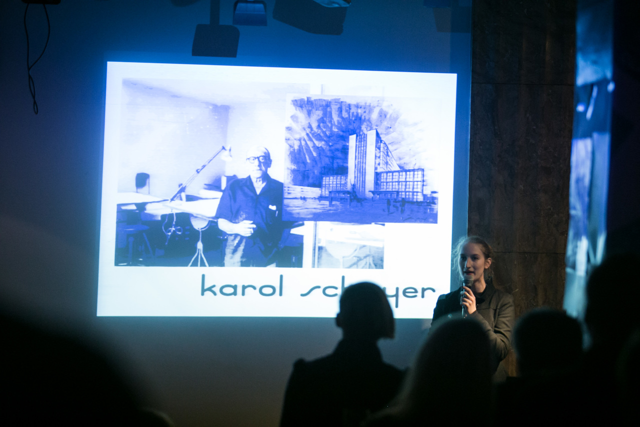
» Schayer Typeface
Schayer typeface was inspired by handwritten lettering used by interwar Katowice architects, including Karol Schayer. The architect’s handwriting style became a direct source of glyph shapes for the new typeface. His lettering is featured on archival plans and projections of the Silesian Museum, a building designed and built in the 1930s. These documents were the basis for an attempt to reconstruct or, more appropriately perhaps, to create a digitised and usable typeface modelled after Schayer’s handwriting. The purpose of the project is to promote Katowice modernist architecture by restoring its accompanying typography. Placing the region’s indigenous lettering style into a contemporary context is an attempt to both celebrate our modernist heritage and create new meanings. By Zofia Oslsilo | Download Schayer Beta (.ttf) -
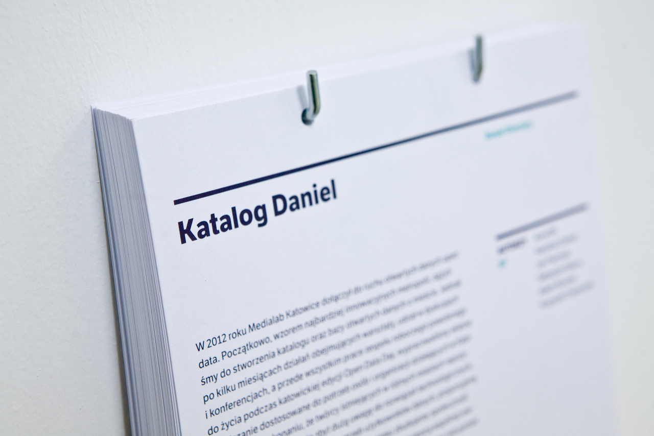
» Daniel Directory: open data solution for Katowice
Upon its 2012 accession to the global open data movement, Medialab Katowice initially followed the example set by the most innovative cities in trying to create a directory and open database for the city. However, after several months of activities including workshops, discussions, conferences and above all the findings of the working group set up during Katowice’s edition of Open Data Day, we have developed our own solution tailored to the needs of individuals and organisations working in Katowice. Being confident that the creators of existing repositories in different cities often attach too much attention to technology, not seeing the real needs of data users, we propose to create an online service that we have called the Daniel Directory. With it, we will build a community focused on solving data problems with the use of knowledge shared by users. If you wish to become a user of the service or you are willing to help in its development, please contact us. -
» Typo-graph
Typo-graph is an experimental way to visualise data using typography as the building blocks of the image. Typographers strive to achieve a uniform column contrast, i.e. a balanced legible text layout. This is sometimes referred to as column ‘greyness’, a term that dates back to the early days of printing, when letters were usually printed in black and dense column of text when viewed from a distance gave the impression of a more or less uniform plane of grey. Modern digital typefaces come in a variety of different weights, offering a wide range of ‘shades of grey’. Hence the idea to use this potential in data visualisation. The intensity of the flow of certain phenomena in time is shown by a computer programmed weight variation of the typeface used for typesetting. The resulting image can be read from a distance as the visualisation of the intensity of the phenomenon at hand, which, in close-up, doubles as its conventional textual description. Find out more. -
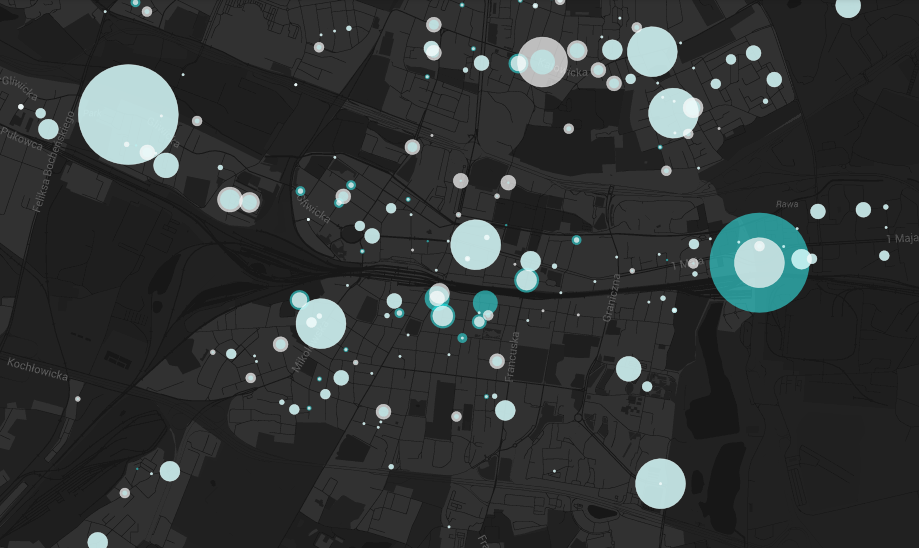
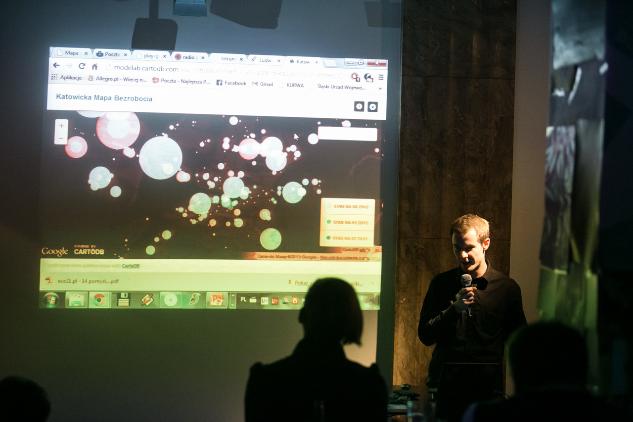
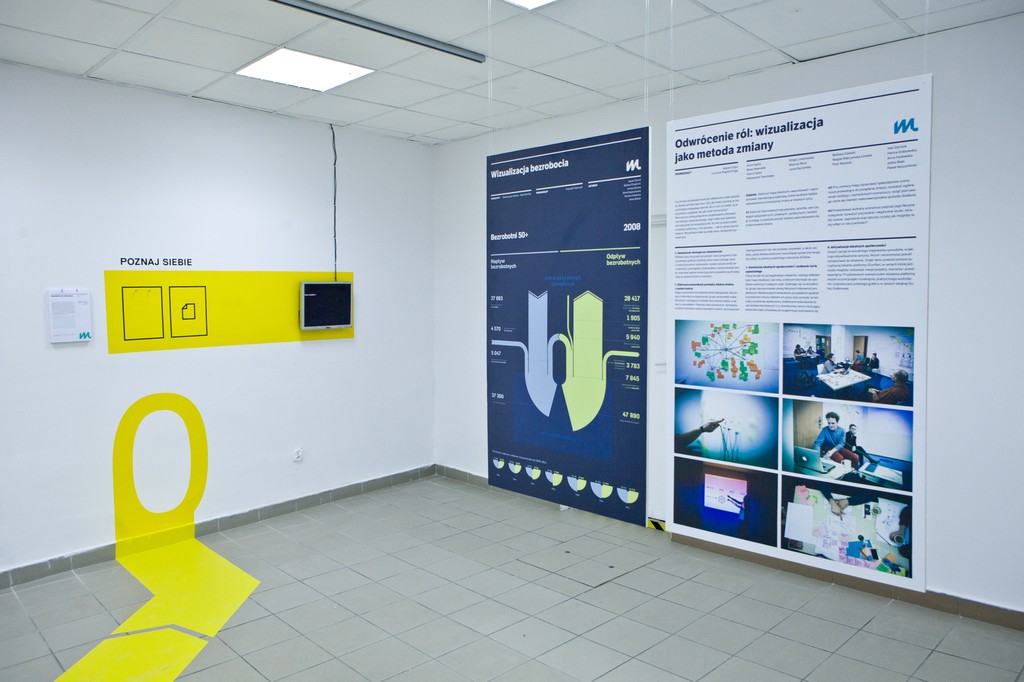
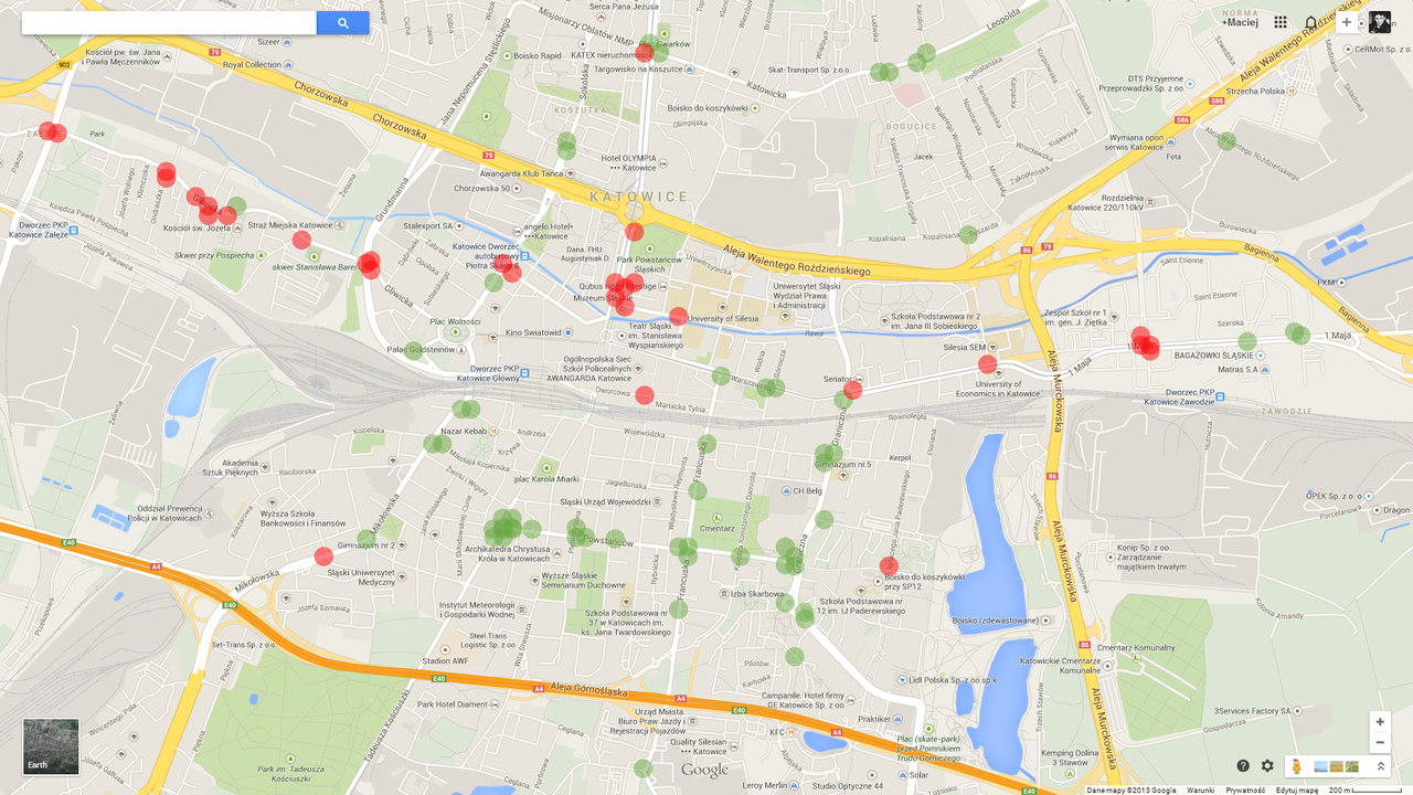
» Katowice Map of Unemployment
The project’s objective is to create a regularly updated, interactive map of unemployment in Katowice, which allows the user to visualize the attached data layers (these currently include general unemployment figures and unemployment rates for under 25s and over 50s, but can be extended to comprise new data). In addition to sharing current and historical data on unemployment, the project also aims to promote the Geographic Information System (GIS) as a clear data visualisation system in the form of maps, allowing for a fast spatial analysis of selected phenomena. The data used comes from materials published by the County Employment Office in Katowice. By Bartosz Chuderski | Go to the map. -
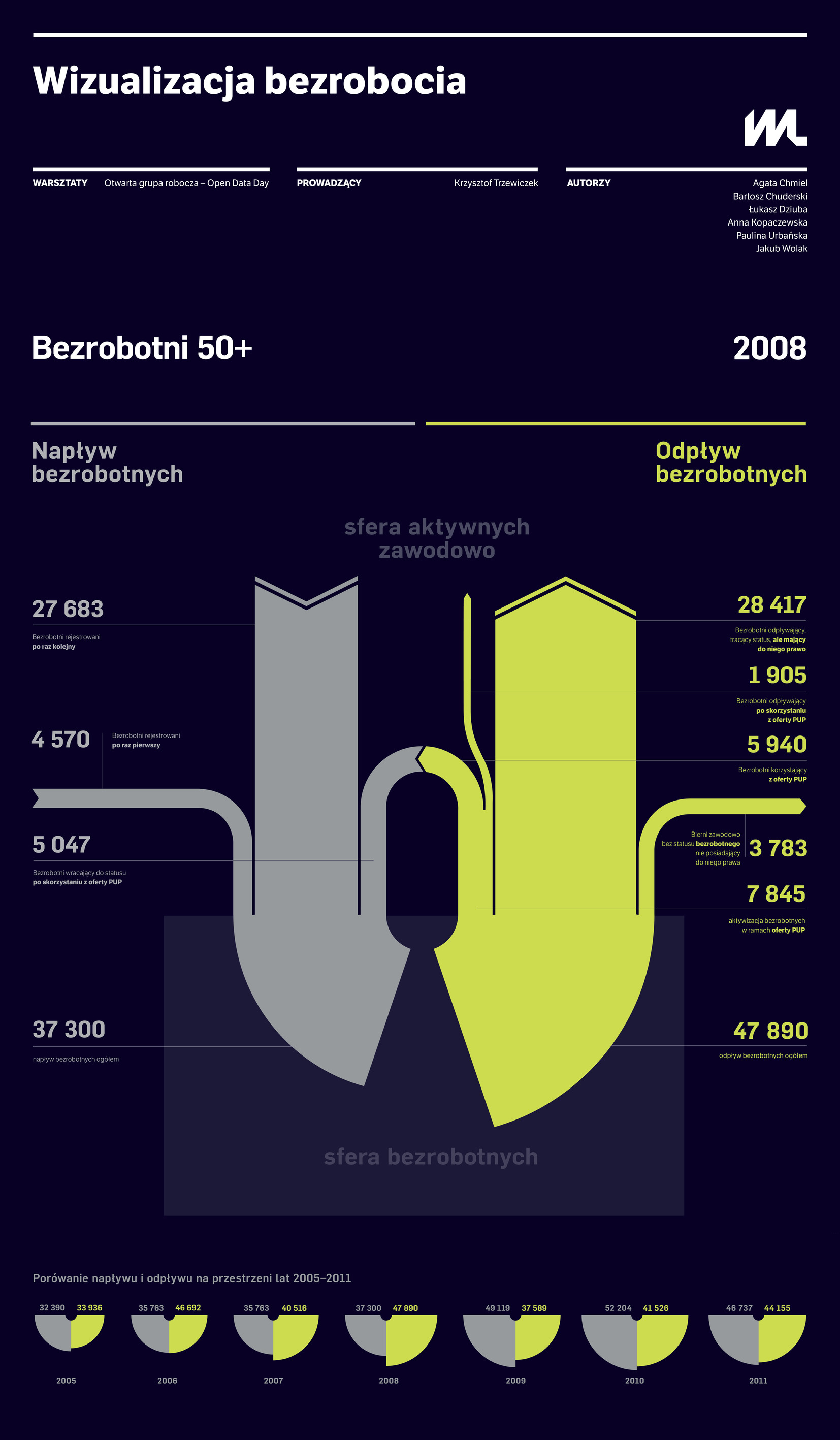
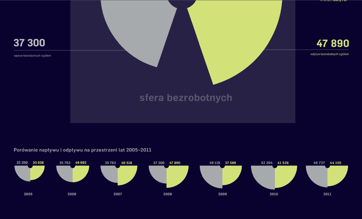
» Unemployment Visualized
Unemployment is a most closely tracked aspect of socio-economic life. The unemployment rate, GDP growth and inflation are the three key parameters to evaluate the condition of any economy. The general nature of these metrics means that they lend themselves well to comparative studies taking into account different countries, periods, age groups, etc. Such generalisations, however, are not free from drawbacks. Without further analysis, it is impossible to get an insight into the processes underlying the surface image of the phenomenon at hand. It is difficult to get satisfactory answers to many questions: What percentage of the overall number of unemployed have registered for the first time? How many people voluntarily give up their unemployed status? What year has seen most people registering as unemployed? Using data on the inflow sources and outflow directions of unemployed people, a new type of graph was created, which aims to provide answers to such questions in a clear manner. Perhaps it will lead to a better understanding of the processes associated with unemployment. -
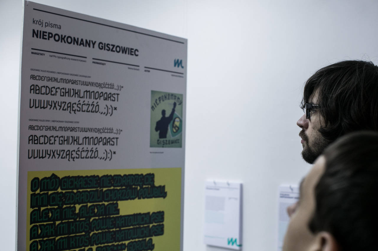
» Giszowiec Rulez Typeface
The inspiration to create a new typeface came from a photo of a mural found on the web and, as it later turned out, also on the official website of GKS Katowice football club fans. Although the City’s walls are often strewn with ugly doodles, some inspiring projects can also be spotted. The mural ‘Niepokonany Giszowiec’ (Giszowiec Rulez) attracted the designer’s attention mainly due to its characteristic letter shapes. While working on the typeface based on the said image, she has introduced her own modifications. She also had an idea that the typeface can be developed to include different versions and, depending on particular design needs, can be either friendly or predatory in nature to either highlight the advantages of Gieksa, as the club is popularly known or to mock an opponent. Two versions were created: rounded, for singing the team’s praises, as well as spiky, used to effectively convey more combative content. Try it out (ttf files). -
» Katowice’s Creative Unemployed Professionals
The idea behind the project is to highlight the fact that the problem of unemployment among university graduates is one of the main causes of the city’s depopulation and the current negative demographic forecast for Katowice. A message in animated form has been prepared and is aimed at Katowice’s authorities and all those officials who have a direct impact on creating a supportive environment for business, employment and innovation to thrive in the city. The aim of the project is to acquaint the target recipient with the idea of the creative class as a factor that could be a catalyst for a positive demographic change. The project has been developed using relevant data from the Central Statistical Office (demography), the Voivodeship Labour Office in Katowice (unemployment) and the National Compensation Research report. -
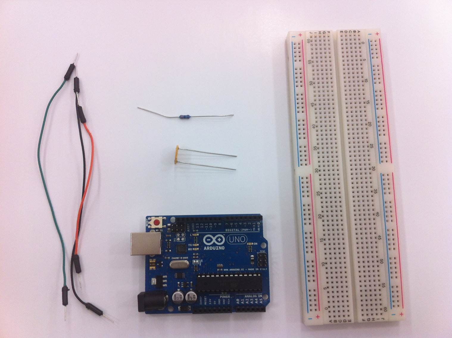
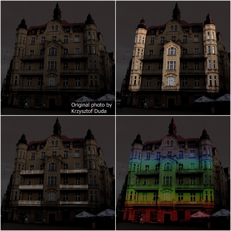
» Flash Sensor: We know when you photograph us!
We combined the Arduino Uno and a light sensor to create a device that measures the amount of light. Our brief research has revealed that the sensor is able to recognise a photographic flash from other sources of light. The solution can be incorporated into smart buildings and objects, which would thus be capable of interacting with the photographer (artist, tourist etc.) by lighting up the most interesting spots one by one. Such spots could include architectural details, such as e.g. reliefs. A more practical purpose would be achieved by collecting data on how many times a single building was photographed, etc. The potential uses of such data could then be used to create tourist maps or popularity rankings for the city sights. Sensory City Workshop | By Łukasz Kopciak & Patryk Łowicki -
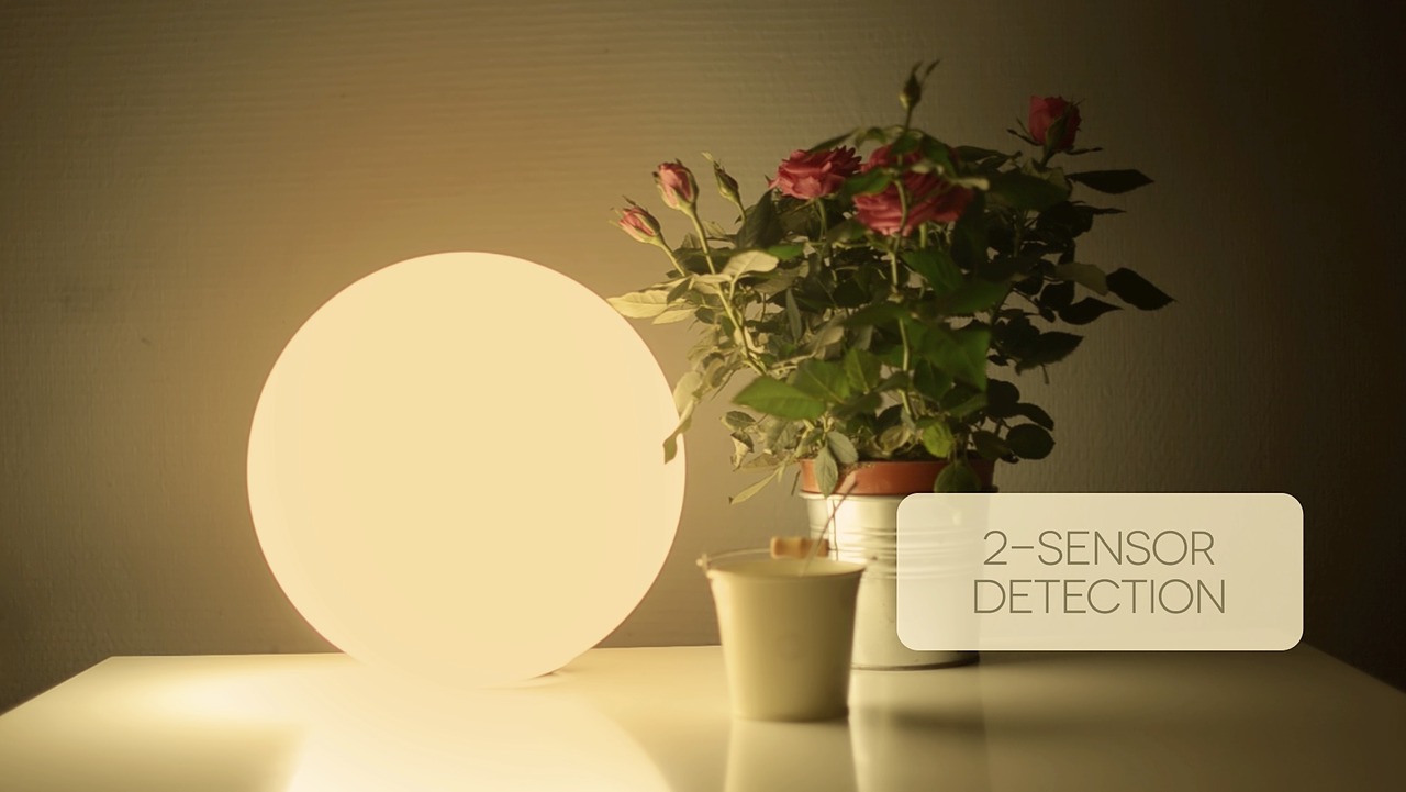
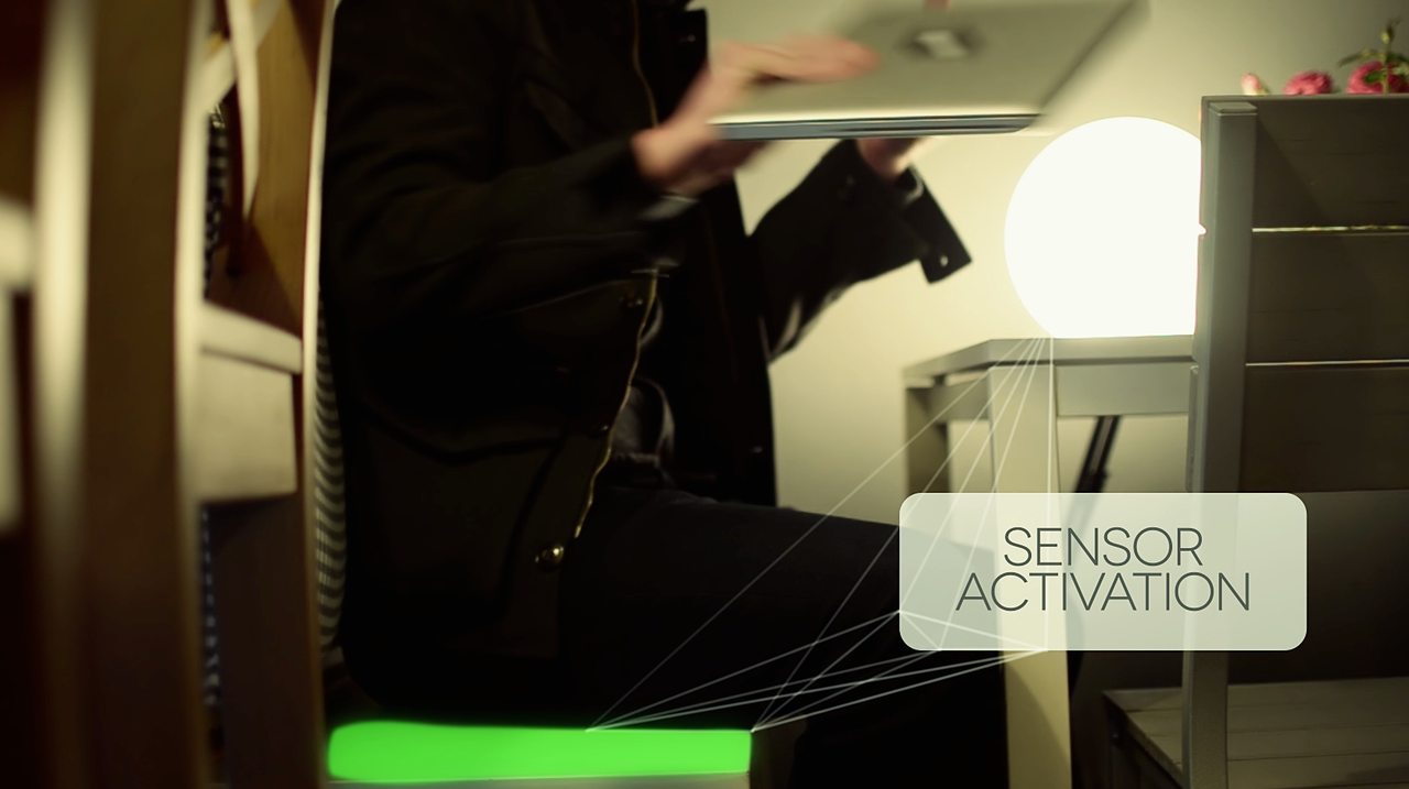
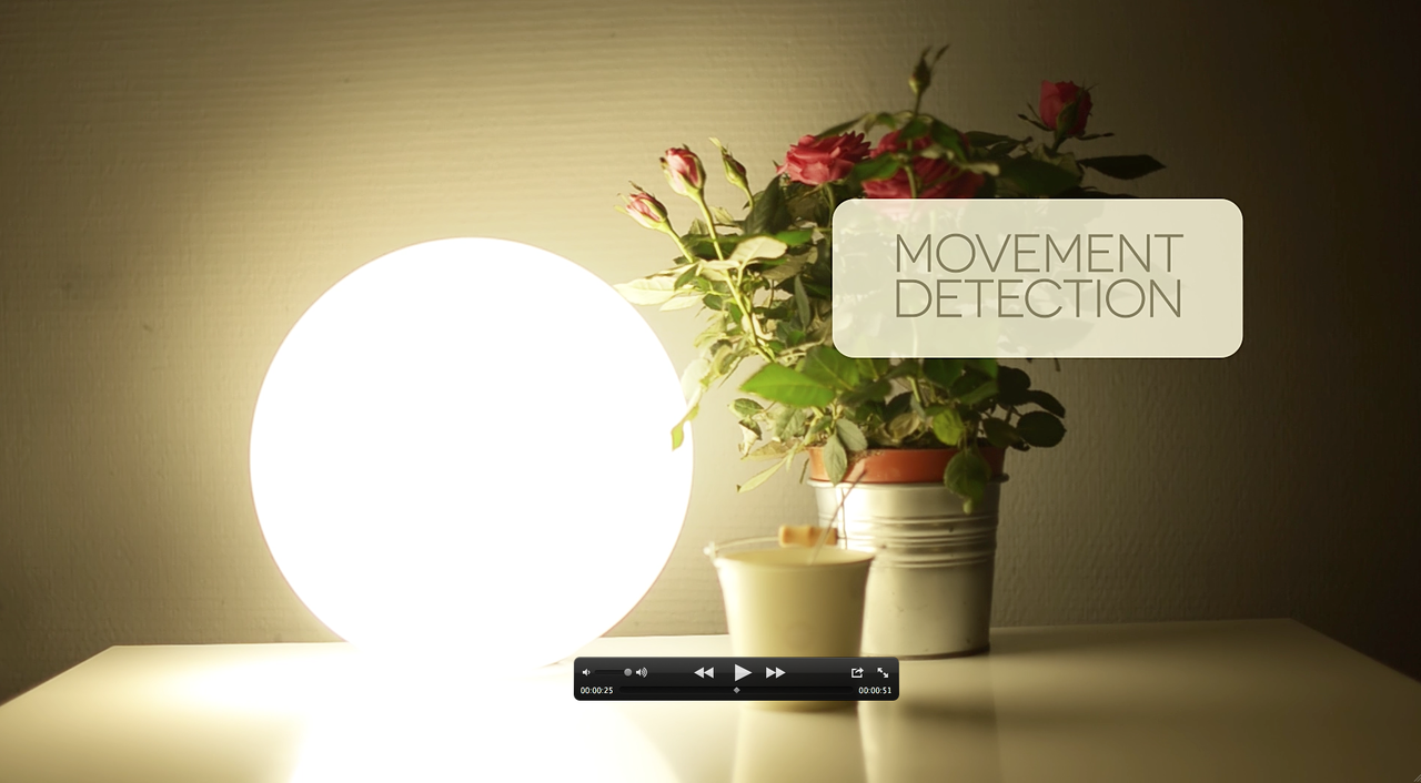
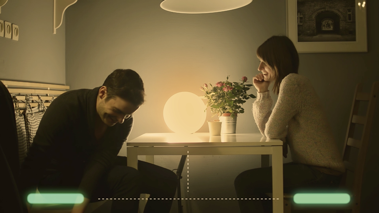
» Luminoo: Intelligent, mood-enhancing light
The Luminoo is an intelligent, context-aware lamp that is able to respond to a variety of different seating arrangements at the table. With a system of chair-mounted sensors the Luminoo can recognise how many people are sitting at the table and what activities they are engaging in. If a person is working, the lamp can provide a bright light conducive to concentration and work. However, if the people at the table are enjoying a chat, the lamp is able to match the new scenario with a friendly atmosphere under dim. By modifying the lighting environment, the Luminoo is capable of enhancing the moods of the people around. This innovative concept can be considered a contribution to the discussion on the Internet of Things, where everyday items are in some way aware of their surroundings and the context in which they are used. Sensory City Workshop | Tomasz Gęstwicki & Szymon Kaliski. -
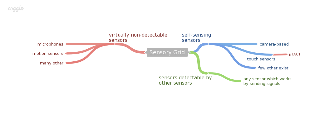
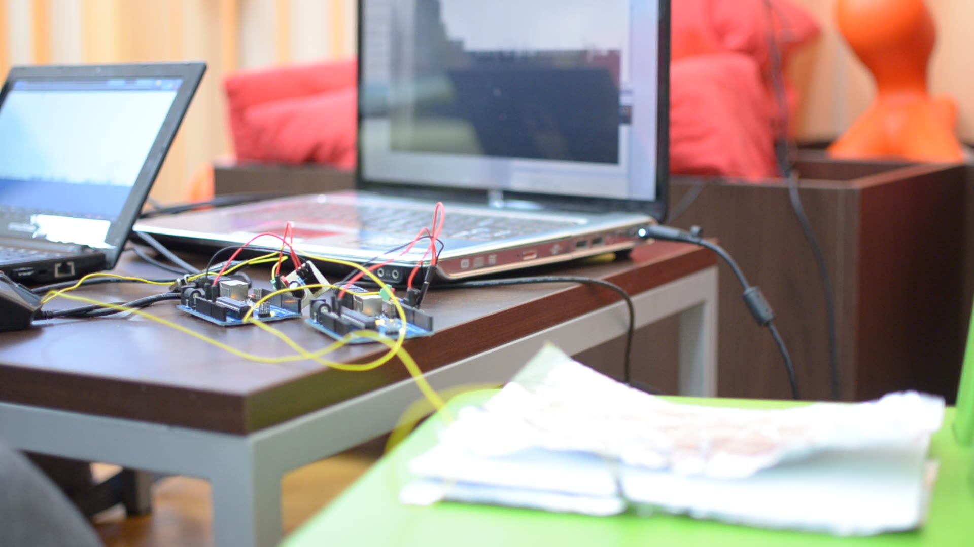
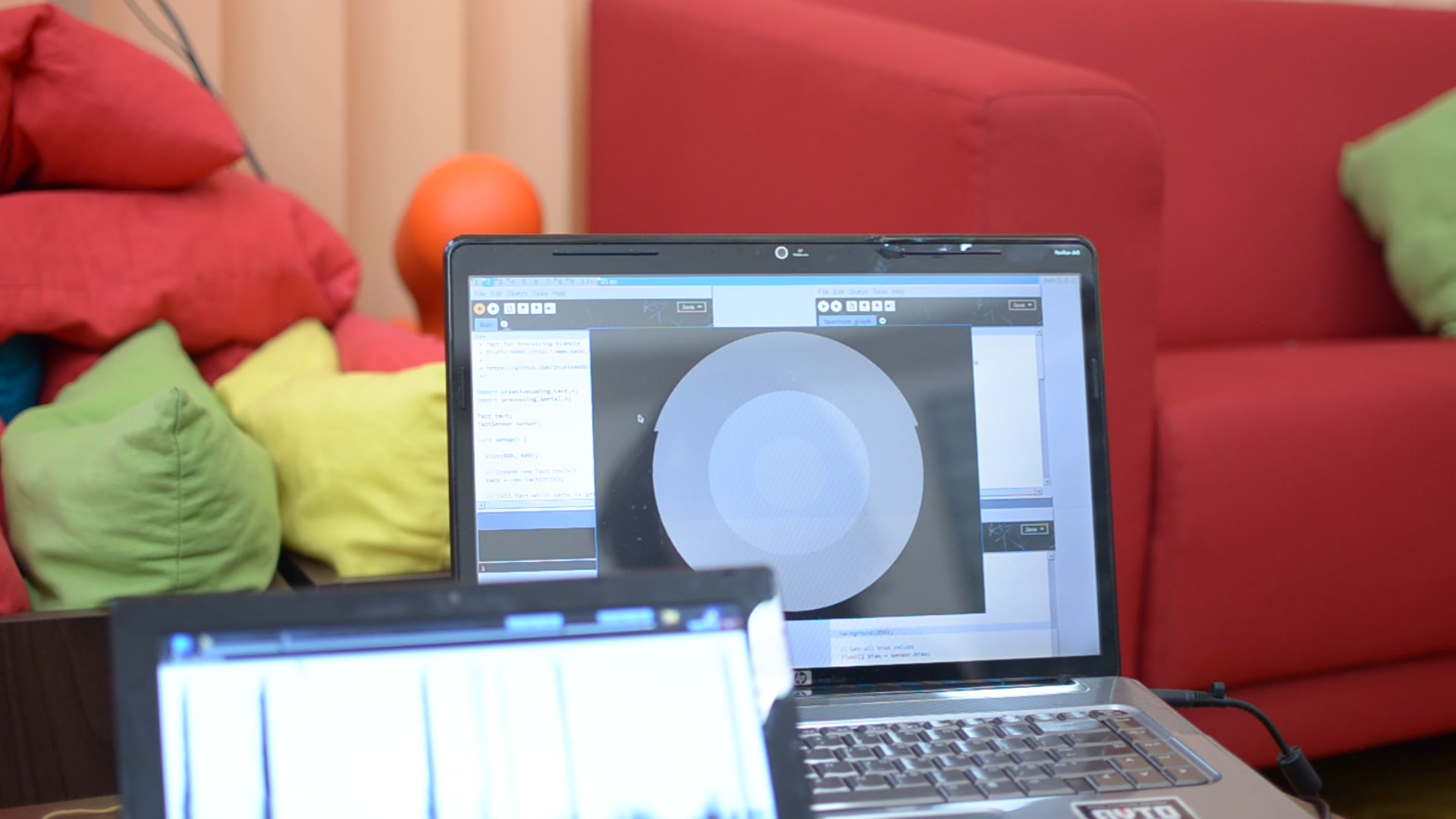
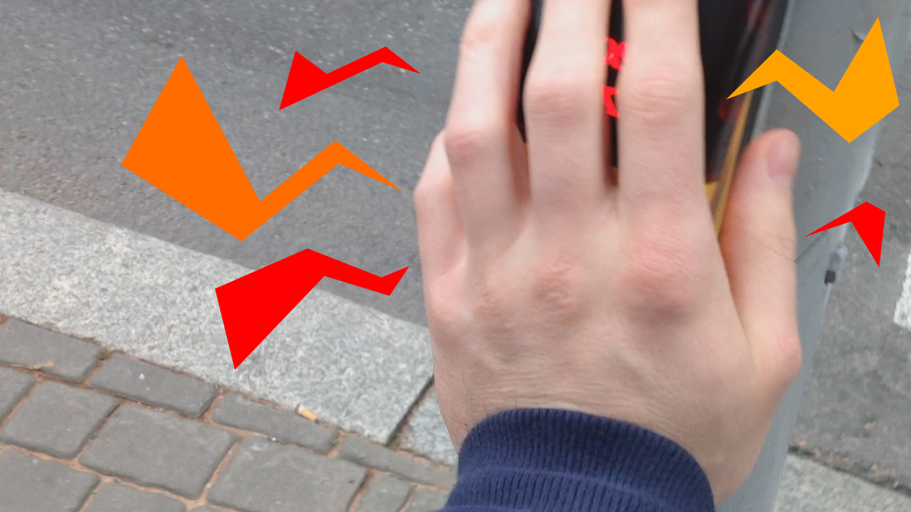
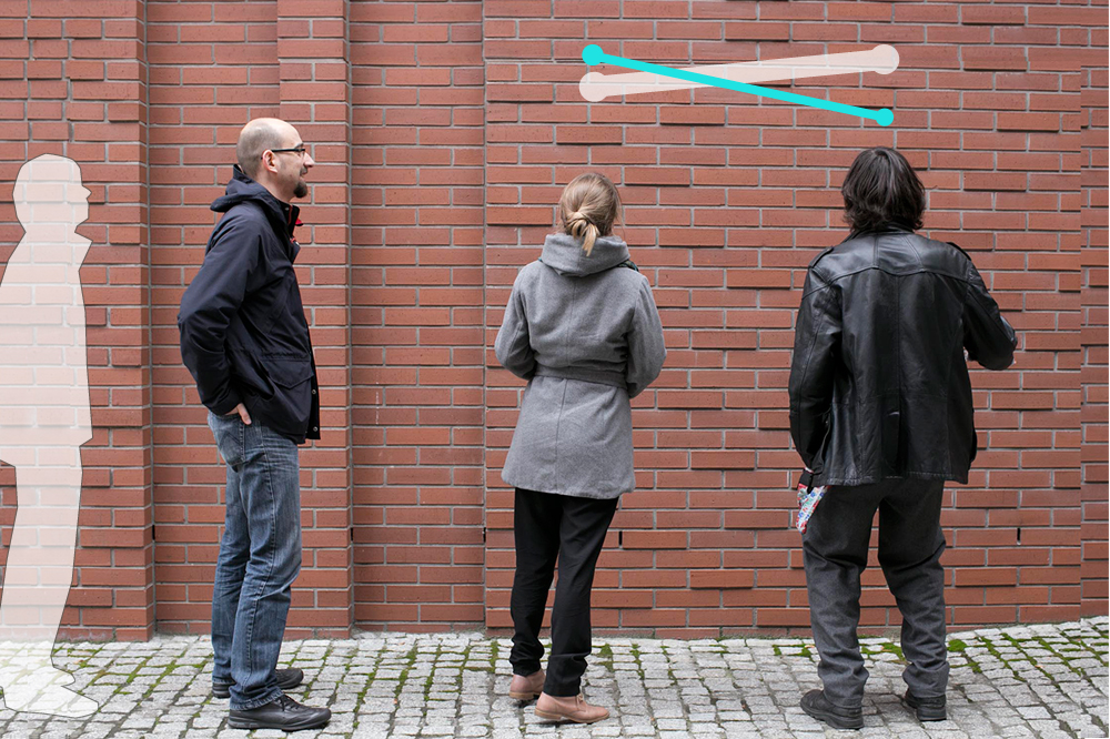
» Detecting Sensory Grid Sensors: Who watches the watchmen?
A matrix of sensors is an integral part of any modern city space. It is a sensory grid, arranged as a geographically distributed network comprising a variety of devices designed to provide convenience for citizens. The sensors, which collect data on us, are hidden from public sight so as not to interfere with the cityscape. As a result, privacy issues are becoming more and more evident. The big question is: who watches the watchmen? We need to be able to detect the sensors, which we can accomplish by means of self-sensing. A self-sensing sensor is able to detect another one of the same kind with only a few specific types of sensor being able to perform this task. The video presents a method of detecting a µTACT touch sensor with another µTACT. One of the answers to the initial question can thus be: the watchmen watch themselves. [Project by: Rafał Piątkowski]. -
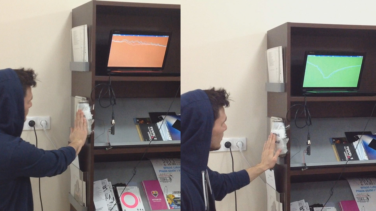
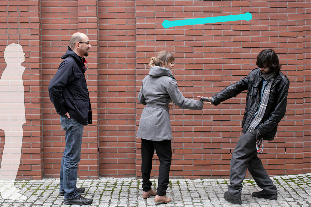
» Urban Mood: Social connections in an interactive city
As a need to create stronger social connections is an ever increasing issue, a way to check what others feel seems to be a potential step in the right direction. And we don't have to focus on obvious signs like face expressions. Instead, we can perhaps choose a more subtle and discreet method. Maybe it is possible to go for small things we have never even considered, like little unconscious gestures capable of revealing a person's mood. We might not be aware that we can actually collect data based on those gestures and yet such information could foster improved integration between urban space and its inhabitants towards a better life in the city. Using the microTact sensor by studio NAND we can check how people behave, how they touch things in the city and how they interact with architecture and urban space. Can we also check how they feel? [Project by: Maciej Kodzis]. -
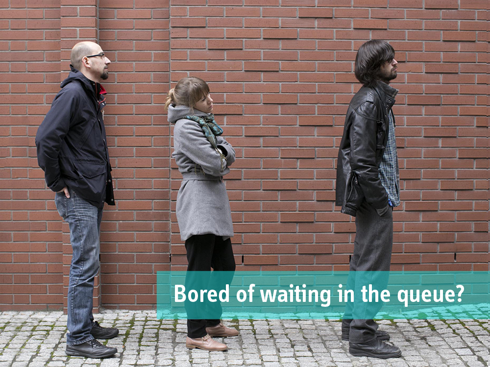
» ZIG-ZAG: What if queuing up wasn’t that boring?
The fact, that the urban environment is unfavourable from the social standpoint is common knowledge. The aim of this project is to reduce the level of anonymity by involving strangers in positive interactions and to form short-term, ad-hoc teams that will cooperate to achieve a common goal. The game we have designed makes use of the fact that in certain situations people follow specific patterns and share similar emotions. A long, slow-moving queue to an entertainment venue (theme park, concert hall, theatre etc.) provides a suitable environment for this kind of experiment, since a mixture of boredom and excitement is capable of creating a potent context for social interaction. To make the game as accessible and intuitive as possible, the player's height is used as a controller. [Project by: Karolina Chmiel & Jakub Wolak]. -
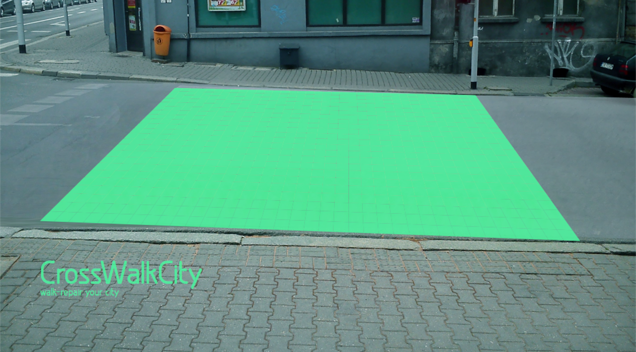
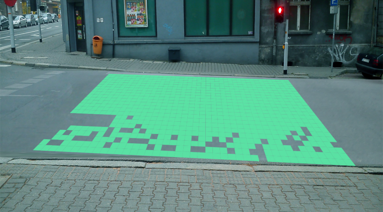
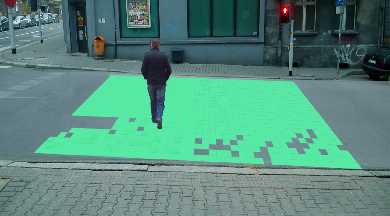
» City Cross Walk: Walk-Repair Your City
The project is an attempt to make drivers aware of the negative impact of driving motorised vehicles within the city compared to the health benefits of walking. The installation would operate at selected pedestrian crossings in the city. A green image projected onto the zebra crossing is designed to change interactively, depending on whether a vehicle passes or a pedestrian walks across. When a car crosses the ‘zebra’, the green path disappears to come back on again on sensing a pedestrian approaching the crossing. [Project by: Adam Grabowski & Hanna Grabowska]. -
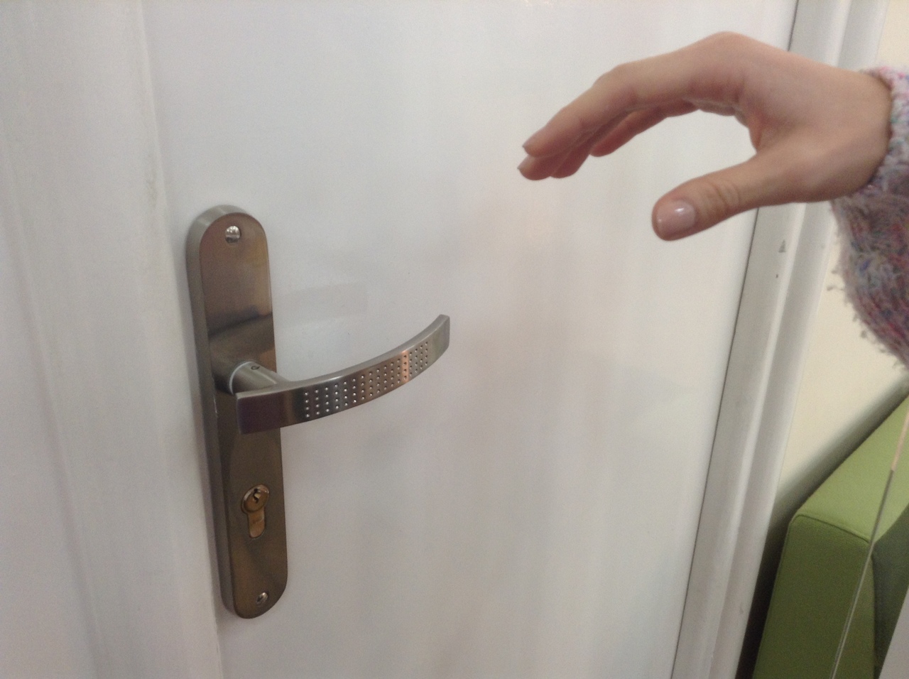
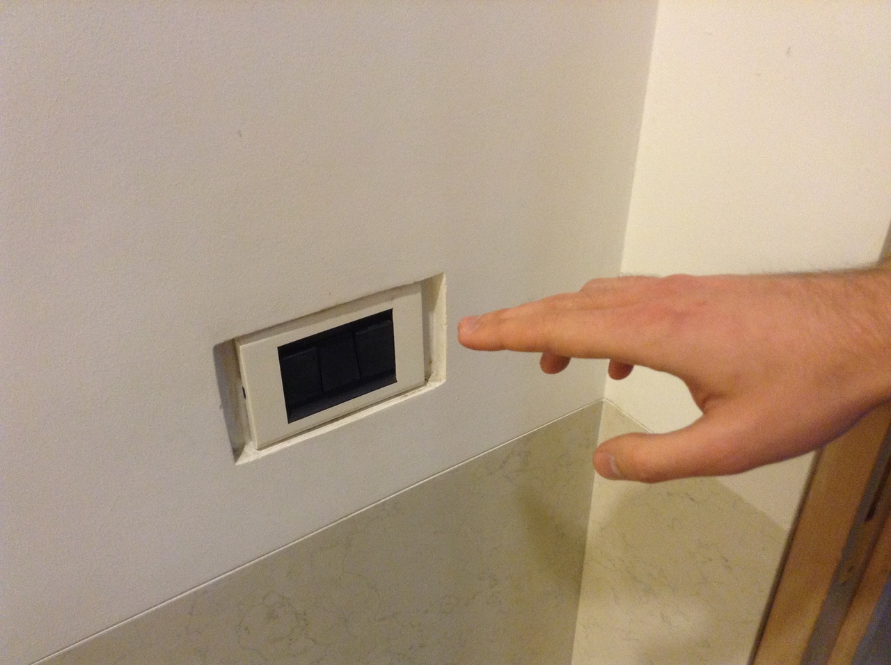
» Smart Objects: Objects that know what you want to do before you actually do it
The idea is to improve everyday objects thanks to anticipating the intentions of their users. These new objects are able to respond to changes in the environment in order to ‘understand’ and respond to our needs and expectations. An illustrative example is the improvement of the door opening process, which, as we all know, requires two steps: unlocking and depressing the handle. The proposed modification is to automate the process by disengaging the lock when the hand of the user approaches the door handle. The door guesses the intention of the user and eliminates the need to perform redundant activities. Another scenario concerns a gradual brightening of light in response to the user approaching a light switch with his hand. In addition to making it easier to find the switch itself, the innovation also offers a the convenience of looking around the room without touching the switch. By depressing the switch the user turns on the light. I the hand is withdrawn at this stage, however, the light will gradually go out. [Project by: Dawid Górny & Anna Widera].
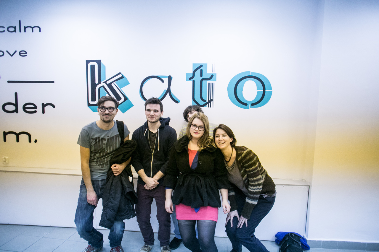
Medialab Katowice
a brief roundup of 2013